2020 has most certainly been a year of monumental change. And while most of us are incredibly happy to see the clock tick over to 2021, it hasn’t all been negativity and upheaval. For many businesses it’s been a time to take a look in the mirror and see how accurate the reflection is. We looked. What we saw was the opportunity to better and more clearly communicate who we are, what we do, and where we fit within our greater community.
Our own journey of brand re-evaluation began at exactly that point: community. The community has always been central to what Clubs Queensland does and it truly embodies everything we do. The personal connection to our clubs, members, associated businesses are all part of the strength of what makes us who we are. In turn, through the connection with Clubs Queensland, community clubs can become stronger and serve to strengthen their own local communities. Essentially, with thriving clubs, the community at large can be healthier, happier and more motivated.
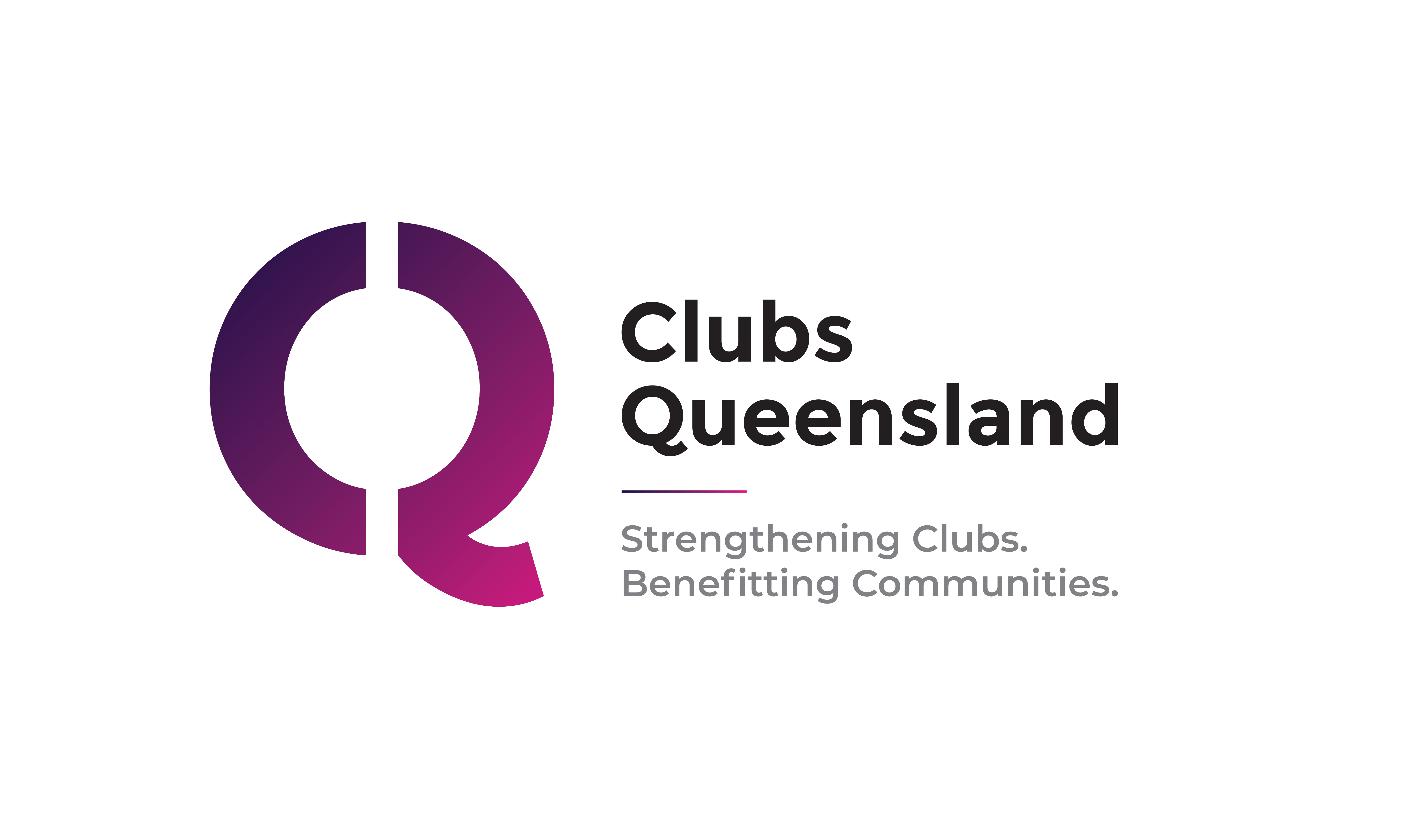
These ideas formed the basis for the development of our new brand elements including our new logo, brand statement, tagline and simplified colour scheme with creative agency, Horse & Water.
“It was important for us that any visuals for Club Queensland were 100% representative of Queensland,” said Dave Swan, H&W director. “The new branding not only represents the strength of Clubs Queensland’s core purpose, it encapsulates a statewide commitment to members.”
Enter the Clubs Queensland “Q” icon…
A stylised letter Q is an insignia with such a proud heritage that is immediately identifiable with the state of Queensland, however ours has been modified to incorporate the acronym for Clubs Queensland – a letter C and a Q, combined into a single, strong Q symbol. And while our blood is 100% maroon, our new colour palette is mix of Queensland maroon with a bit of famed club entertainment mixed in - a blend of heritage and vitality.
When it came to the wording and finding a short, memorable motto, we wanted to truly and simply describe our purpose and commitment. Our new Clubs Queensland brand statement provides that clarity in a simple four words:
“Strengthening Clubs.
Benefitting Communities.”
It’s what Clubs Queensland aspires to achieve - to make community clubs stronger so they can better serve their respective communities. Like us, our brand statement is present, active and positive!
But then, we went a step further.
As we’ve explained, this whole journey was not just about us, so during the brand rethink we had to consider how we really communicate our inclusivity and community. What better way to get all on board than an invitation to “Join the Club”?
“The Clubs Queensland tagline is more than a campaign catch cry – it’s a call to arms to drive membership of both Clubs Queensland and that of each respective community club”, said Dave.
Join the Club also serves as a handy acronym to explain the benefits of Clubs Queensland membership:
C – Collective Community
As a collective community of clubs, we are a powerful voice to be heard as we support community benefit, social license and industry sustainability.
L – Lobby
There’s strength in numbers and collectively we are a powerful voice to be heard by all levels of Government.
U – Unequalled support
Our job is to simplify the regulatory environment for you with expert advice and assistance on such things as Workplace Relations and Compliance.
B – Business Benefits
With the support of key industry sponsors who have a vested interest in seeing clubs succeed, we are equipped to assist you in your business endeavours via various unique CQ ways and channels.
At the end of an extensive and positive process, we’re extremely proud to unveil our new branding - you’ll be seeing the Clubs Queensland Q appearing as a firm fixture into the future as a prominent reminder of our commitment to you all. And most of all we’re excited to embark on the next chapter of our adventure together.